CSS 布局
单列布局
header,content,footer 统一设置 width
//jsfiddle.net/sunven/79c5k6nu/embed/html,result/
header,footer 统一设置 width
//jsfiddle.net/sunven/zLa4yhbf/embed/html,result/
两列自适应布局
一列由内容撑开,另一列撑满剩余宽度
float+overflow:hidden
//jsfiddle.net/sunven/09zhpv85/embed/html,result/
flex
//jsfiddle.net/sunven/zqnLcxd8/embed/html,result/
grid
//jsfiddle.net/sunven/L02f53ms/embed/html,result/
三栏布局
中间列自适应宽度,旁边两侧固定宽度
圣杯布局
//jsfiddle.net/sunven/jL82ban1/embed/html,result/
流程图
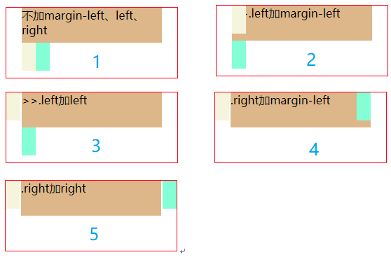
缺点
- center 宽度小于 left 宽度,left 会掉到下一行
- 其中一列过高,其他两列不会自动拉高
伪等高布局
解决了圣杯布局的第二个缺点
//jsfiddle.net/sunven/0tfq6hmn/embed/html,result/
- 利用 padding-bottom 把三列撑到相同“高度”
- 利用 margin-bottom 把下边界还原到原处
- 利用 overflow:hidden 隐藏“超出”部分
双飞翼布局
圣杯布局演化而来
//jsfiddle.net/sunven/t48vxgp3/embed/html,result/
圣杯双飞翼都属于浮动布局
绝对定位布局
- 利用 position: absolute;布局
html
<!DOCTYPE html>
<html>
  <head>
    <meta charset="utf-8" />
    <title>Layout</title>
    <style>
      .layout > div {
        position: absolute;
        height: 100px;
      }

      .left {
        left: 0;
        width: 300px;
        background: red;
      }

      .center {
        right: 300px;
        left: 300px;
        background: yellow;
      }

      .right {
        right: 0;
        width: 300px;
        background: blue;
      }
    </style>
  </head>

  <body>
    <div class="layout">
      <div class="left">left</div>
      <div class="center">center</div>
      <div class="right">right</div>
    </div>
  </body>
</html>
flex
html
<!DOCTYPE html>
<html>
  <head>
    <meta charset="utf-8" />
    <title>Layout</title>
    <style>
      .layout {
        display: flex;
      }

      .left {
        width: 300px;
        background: red;
      }

      .center {
        background: yellow;
        flex: 1;
      }

      .right {
        width: 300px;
        background: blue;
      }
    </style>
  </head>

  <body>
    <div class="layout">
      <div class="left">left</div>
      <div class="center">center</div>
      <div class="right">right</div>
    </div>
  </body>
</html>
table
html
<!DOCTYPE html>
<html>
  <head>
    <meta charset="utf-8" />
    <title>Layout</title>
    <style>
      .layout {
        display: table;
        height: 150px;
        width: 100%;
      }

      .layout > div {
        display: table-cell;
      }

      .left {
        width: 300px;
        background: red;
      }

      .center {
        background: yellow;
      }

      .right {
        width: 300px;
        background: blue;
      }
    </style>
  </head>

  <body>
    <article class="layout">
      <div class="left">left</div>
      <div class="center">center</div>
      <div class="right">right</div>
    </article>
  </body>
</html>- 无法设置栏边距(margin)
- 当其中一个单元格高度超出的时候,其它单元格也是会跟着一起变高
grid
- grid-template-columns 设置列的分布
- grid-template-rows 行高
html
<!DOCTYPE html>
<html>
  <head>
    <meta charset="utf-8" />
    <title>Layout</title>
    <style>
      .layout {
        display: grid;
        width: 100%;
        grid-template-columns: 300px auto 300px;
        grid-template-rows: 150px;
      }

      .left {
        background: red;
      }

      .center {
        background: yellow;
      }

      .right {
        background: blue;
      }
    </style>
  </head>

  <body>
    <div class="layout">
      <div class="left">left</div>
      <div class="center">center</div>
      <div class="right">right</div>
    </div>
  </body>
</html>
粘连布局
padding-bottom、margin-top
- 利用 margin-top 来确定 footer 位置
- 利用 padding-bottom 防止 footer 内容和 main 内容重合
html
<!DOCTYPE html>
<html lang="en">
  <head>
    <meta charset="UTF-8" />
    <meta name="viewport" content="width=device-width, initial-scale=1.0" />
    <meta http-equiv="X-UA-Compatible" content="ie=edge" />
    <title>Document</title>
    <style>
      * {
        margin: 0;
        padding: 0;
      }

      html,
      body {
        height: 100%;
      }

      #wrap {
        min-height: 100%;
        background: pink;
        text-align: center;
        overflow: hidden;
      }

      #wrap .main {
        padding-bottom: 50px;
      }

      #footer {
        height: 50px;
        line-height: 50px;
        background: deeppink;
        text-align: center;
        margin-top: -50px;
      }
    </style>
  </head>

  <body>
    <div id="wrap">
      <div class="main">
        <p>1</p>
        <p>2</p>
        <p>3</p>
        <p>4</p>
      </div>
    </div>
    <div id="footer">footer</div>
  </body>
</html>
calc
- 利用 calc 计算实际高度
html
<!DOCTYPE html>
<html lang="en">
  <head>
    <meta charset="UTF-8" />
    <meta name="viewport" content="width=device-width, initial-scale=1.0" />
    <meta http-equiv="X-UA-Compatible" content="ie=edge" />
    <title>Document</title>
    <style>
      .content {
        min-height: calc(100vh - 50px);
        background-color: antiquewhite;
      }

      .footer {
        height: 50px;
        background-color: aquamarine;
      }
    </style>
  </head>

  <body>
    <div class="content">
      content
    </div>
    <footer class="footer">footer</footer>
  </body>
</html>
flex
- footer 可以根据内容变化高度
html
<!DOCTYPE html>
<html lang="en">
  <head>
    <meta charset="UTF-8" />
    <meta name="viewport" content="width=device-width, initial-scale=1.0" />
    <meta http-equiv="X-UA-Compatible" content="ie=edge" />
    <title>Document</title>
    <style>
      html {
        height: 100%;
      }

      body {
        min-height: 100%;
        display: flex;
        flex-direction: column;
      }

      .content {
        flex: 1;
        background-color: antiquewhite;
      }

      .footer {
        background-color: aquamarine;
      }
    </style>
  </head>

  <body>
    <div class="content">
      content
    </div>
    <footer class="footer">footer</footer>
  </body>
</html>
grid
- grid-template-rows 确定了 footer 的高度
html
<!DOCTYPE html>
<html lang="en">
  <head>
    <meta charset="UTF-8" />
    <meta name="viewport" content="width=device-width, initial-scale=1.0" />
    <meta http-equiv="X-UA-Compatible" content="ie=edge" />
    <title>Document</title>
    <style>
      html {
        height: 100%;
      }

      body {
        display: grid;
        grid-template-rows: 1fr auto;
        min-height: 100vh;
      }

      .content {
        background-color: antiquewhite;
      }

      .footer {
        background-color: aqua;
      }
    </style>
  </head>

  <body>
    <div class="content">
      content
    </div>
    <footer class="footer">footer</footer>
  </body>
</html> 鄂公网安备 42011502001402号